Building the Zenith Portfolio: Antigravity UI, Codex-assisted workflows, and a content-first stack
This write-up documents how the portfolio was built end-to-end: the visual system, the Antigravity scroll hero, the admin dashboard, and the MDX-driven content pipeline (projects + blog). It is based on the current codebase structure and the instrumentation patterns we used while iterating. There were no implementation.md files found in the repo, so the narrative below is synthesized from the source layout and runtime behavior.
Stack: Next.js 16 (App Router), Tailwind v4, Framer Motion, Prisma (SQLite), MDX Remote, and a custom admin dashboard.
1) Vision and layout map
The goal was to make the site feel engineered and cinematic at the same time: a grid-based layout with glass layers, neon-soft gradients, and tactile interactions. That meant a few guiding rules:
- Dark surfaces + subtle noise to create depth.
- Bold typography with tight tracking.
- Motion as narrative (not decoration).
- One design system across landing, work, blog, and admin.

2) The Antigravity hero (scroll-synced canvas)
The hero uses a frame sequence rendered into a <canvas> and synced to scroll progress. This gives a cinematic feel without shipping a giant video file.
Core logic:
// components/AntigravityHero.tsx
const { scrollYProgress } = useScroll({
  target: containerRef,
  offset: ['start start', 'end end'],
});

const frameIndex = useTransform(scrollYProgress, [0, 1], [0, 117]);
Image preloading comes from useImageSequence:
// hooks/useImageSequence.ts
for (let i = 1; i <= totalFrames; i++) {
  const img = new Image();
  img.src = `/sequence/frames/${frameFormat}.jpg`;
  img.onload = () => setProgress(prev => Math.min(prev + (100 / totalFrames), 100));
}
3) The universal Dock (global navigation + tooltips)
The dock is global and consistent across pages, with hover magnification and tooltip labels. It is inserted once in app/layout.tsx, which keeps nav behavior consistent and avoids per-page duplication.
// app/layout.tsx
<SecretKeyListener />
<UniversalDock />
{children}
<Footer />
The dock uses motion-based width scaling and pointer-safe overlays:
// components/magicui/dock.tsx
const widthSync = useTransform(distanceCalc, [-distance, 0, distance], [40, magnification, 40]);
const width = useSpring(widthSync, { mass: 0.1, stiffness: 150, damping: 12 });
4) Content systems: Projects + Blog (MDX)
Projects and blog posts are both authored in MDX and stored in the database for easy editing inside the admin dashboard.
Blog model (Prisma)
model BlogPost {
  id         String   @id @default(cuid())
  title      String
  slug       String   @unique
  excerpt    String
  content    String   // MDX content
  coverImage String?
  tags       String   // JSON array
  published  Boolean  @default(false)
  featured   Boolean  @default(false)
  date       DateTime @default(now())
}
The rendering path uses next-mdx-remote:
const mdxSource = await serialize(post.content);
return <BlogPostClient post={post} mdxSource={mdxSource} />;
The MDX component styles are centralized in components/MDXContent.tsx with explicit typography, code block styling, and image handling.
5) Blog experience (interactive, visual, showcase-ready)
The blog list uses a featured grid, cards with hover glow, and tag chips. Posts include:
- Hero cover image
- Reading time
- Tag pills
- Sticky summary + tags on desktop
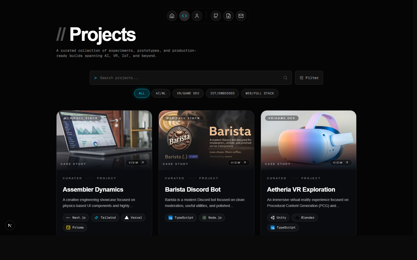
6) Work section + story flow
Work cards are designed as editorial story tiles: clean hierarchy, thumbnail overlays, and motion-safe hover states. The work page uses a filtered grid for experiments and production builds.
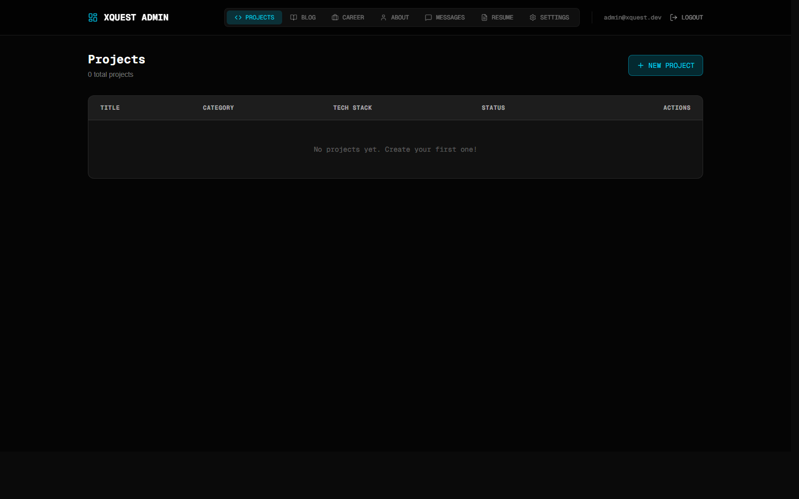
7) Admin dashboard (projects + blog + resume)
The admin dashboard manages projects, blog posts, messages, and resume versions. Resume versions are stored in DB and files live in public/resumes.
8) Release flow
- Design -> build in the App Router.
- MDX content authored in admin -> stored in DB.
- Images live in
/public/blog/portfolio-buildfor predictable URLs. - Footer + dock shared across pages for consistency.
9) What I'd improve next
- Real-time MDX preview in admin
- Tag-based filtering on
/blog - Footnotes + citations inside MDX
- Blog RSS feed powered by DB
If you are building a portfolio in 2026, design it like a product: structure + motion + clarity + content. This project made the site feel less like a static portfolio and more like a living system.